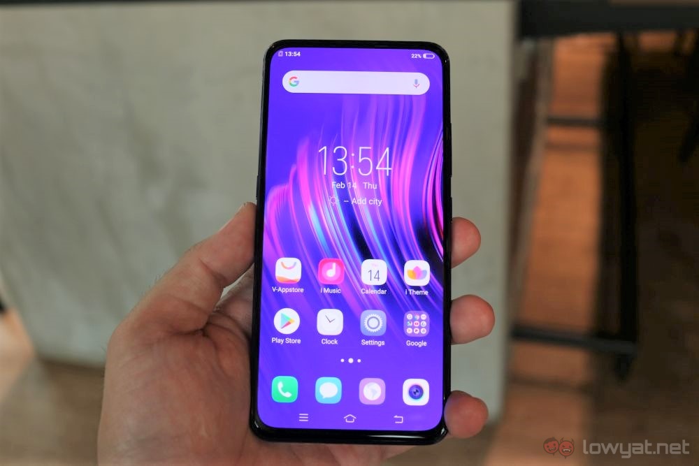
To start, the most obvious thing about the phone is that the display has the front of the phone all to itself. This is a very refreshing sight, and not exactly a common thing anymore since the advent of notches and cutouts.
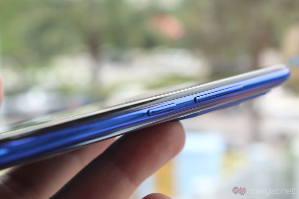
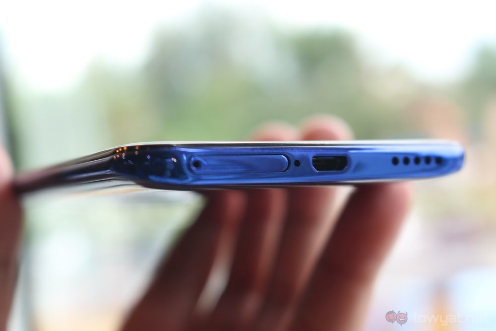
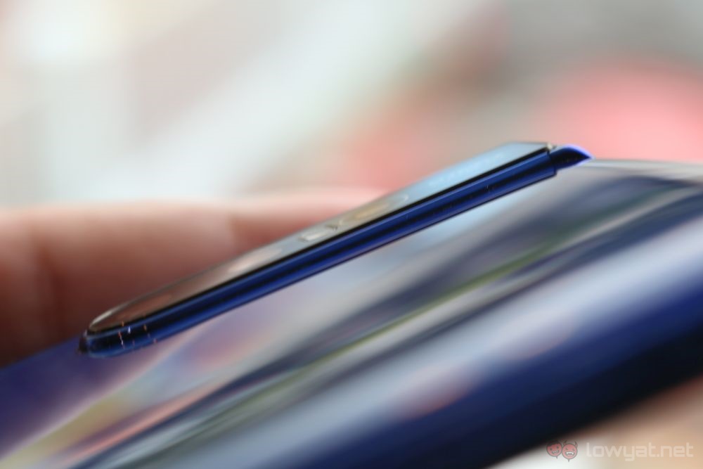
The phone itself sits quite nicely in hand. There’s a surprising amount of heft to it for something so thin. And it feels pretty obvious that it’s mostly in the top half of the phone, for reasons that will be clear soon. Looking around, most things are where you expect them. Round the bottom, you see the Micro-USB port, flanked by the speaker grille and the SIM tray. The power button is on the right, with the volume rocker sitting above it.
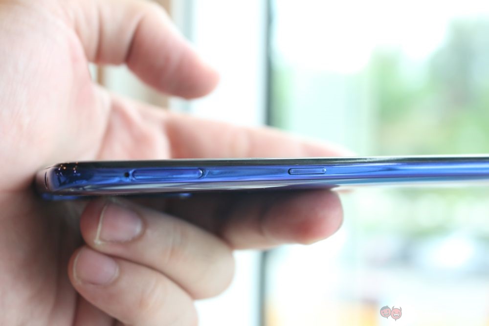
Oddly enough, there’s another tray on the left. The tray is where you’ll put your microSD cards – that’s right, the SIM and microSD cards get their own trays. There’s also another button on the left, just below the microSD card tray. pressing this brings up the Google Assistant. This makes for a secondary way to bring up the assistant. We’re not sure if it can be reprogrammed to do something else, or if it can be turned off, but it’s very much reminiscent of Samsung’s Bixby key.
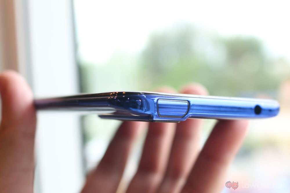
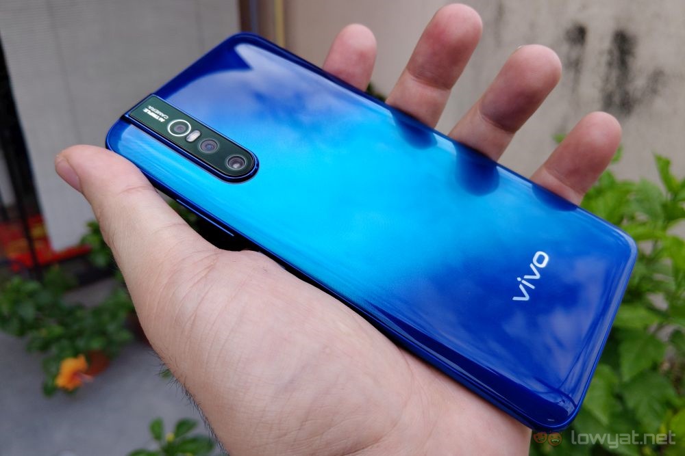
At the top, you’ll find the 3.5mm jack and a segment that looks like it’s been cut out. The segment sits right where the rear camera bump is, which is pretty smart as far as aesthetic design goes. And yes, the rear camera bump is still here although I’m personally not a fan of it. On the bump, you’ll see the three-camera array with an LED flash. At this moment, we are not privy to their actual specs but we do know from Vivo India’s website that one of the camera has a 48MP sensor.
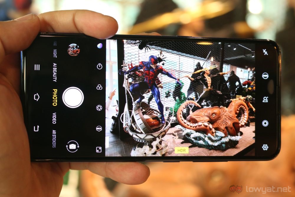
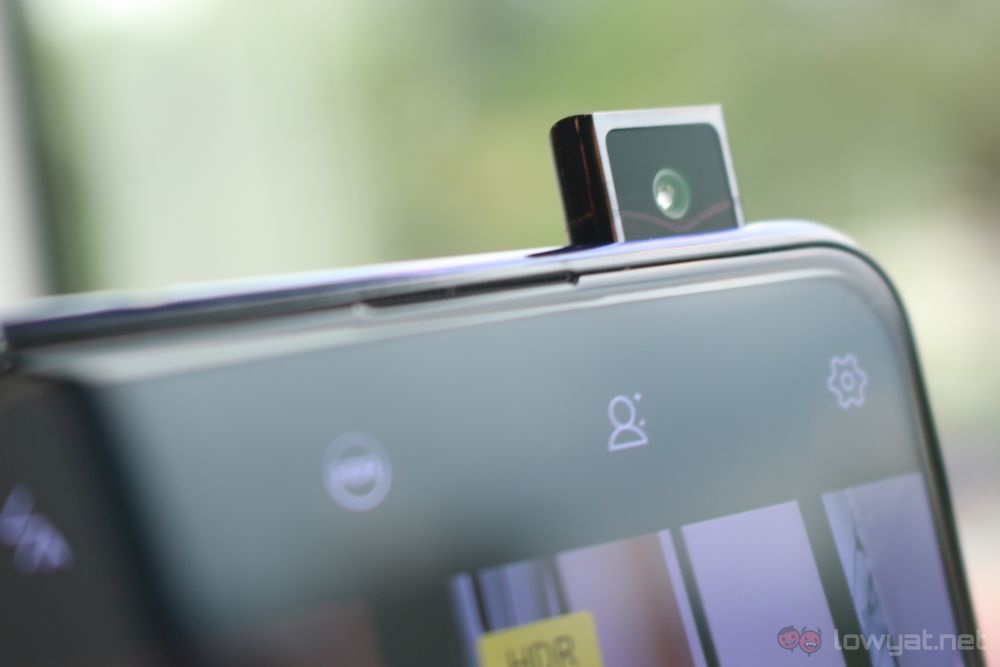
Now, to get back to the question of the 32MP selfie camera. That’s what the cutout at the top is for, and it pops up whenever you engage the front-facing camera, or when you choose to unlock the V15 Pro using facial recognition. Due to our limited time with the device, we not able to check out the potential capabilities of the V15 Pro though. Nevertheless, one thing we can tell you for sure that this phone is quite a looker not only due to the excellent Topaz Blue finish but also the two-tone effect that Vivo has applied to it.
After all the phones with notches on the screen, the V15 Pro is a breath of fresh air, what with nothing else taking up screen space. That, and the pretty Topaz Blue colourway may be reason enough to get one, but we’ll have to wait until we put it through its paces – and find out its price – before we decide for sure. For now, Vivo Malaysia has yet to reveal the exact release date for the V15 Pro in our market. Nevertheless, it shouldn’t take long though since the phone will be made available for pre-order on 26 February.
